Why your website's fonts might be larger than intended
Someone recently reported that the font-size in some of my code blocks on my build-your-own Next.js blog post was too large. That's interesting because I use React and the code blocks are the same component. So why would the font-size be different between them?
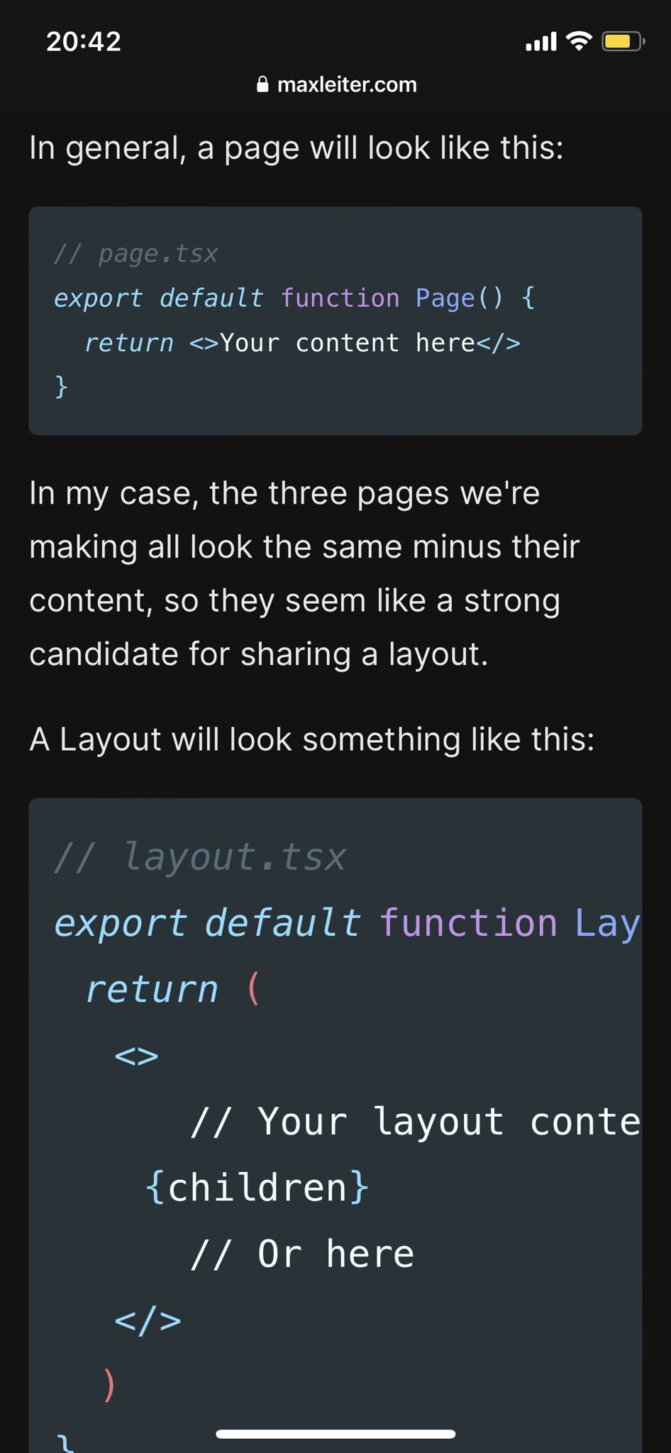
I was able to reproduce the issue and found that it only happened on iOS devices. Here it is in action:

After adventuring down a small rabbit hole, I can share that mobile devices (mostly tablets/phones) support the text-size-adjust CSS property that automatically adjusts the font size of text to make it more readable. This is a great feature for most websites, but it can be problematic for code blocks. It's worth noting that all browsers support this feature (although WebKit requires a prefix), but it seems like they use different heuristics to determine when to apply it.
Here's a solution:
This disables the feature and makes the font size consistent across all browsers. Be careful though, because this will disable the feature for your entire site. You may want to specifically opt certain elements out to let the feature work as intended.